
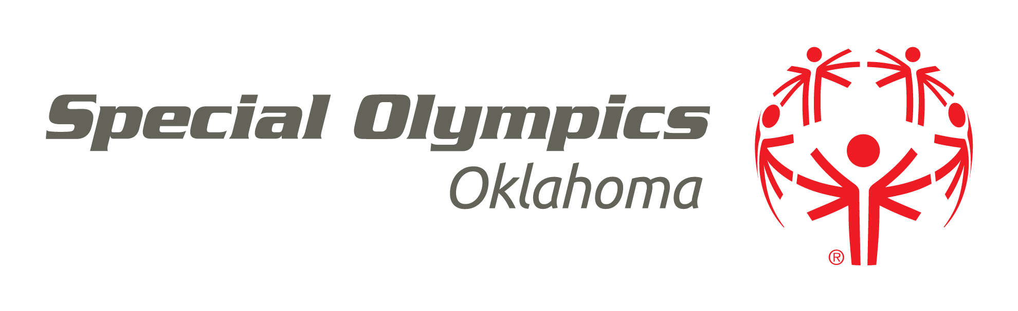
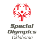
SPECIAL OLYMPICS OKLAHOMA LOGO
Our brand is our reputation, a reputation shared by all of the programs within Special Olympics. This reputation exists in the hearts and minds of the public and our stakeholders. Our reputation is informed primarily by what we do but it is also influenced by what and how we communicate.
The Special Olympics Accredited Program Mark is used to brand communications and items created by Special Olympics Accredited Programs.The mark is created by combining the Special Olympics Symbol, the Special Olympics Logotype and the name of the Accredited Program (Oklahoma) set in the typeface Ubuntu Italic. (Ubuntu is available as a free Mac or PC download at font.ubuntu.com.)
Color
Symbol: Special Olympics Red (Pantone® 186)
Logotype and Oklahoma: Special Olympics Grey (Pantone® 418)
Two-Color artwork version:
These versions (greyscale & red) of the mark are for use against white backgrounds.
Single-Color artwork version:
This version (all black or all white) of the mark is for use against a light, low-contrast background. Ensure there is sufficient contrast between the Mark color and background color.
The White version of the mark is for use against dark solid colors and appropriate photographic images.
Free Space
Free space should be left around the mark.
No other graphic elements or information should be used in this area.
Minimum Size
The minimum size is 1/3 inch or 8mm in height.
Please note this is a recommendation for standard print only. The minimum size will depend on the method of reproduction being used, the substrate onto which it is being printed, or the materials out of which the mark is being fabricated.
The one-line lock-up is ideal where more horizontal space can be afforded for the mark (preferred):

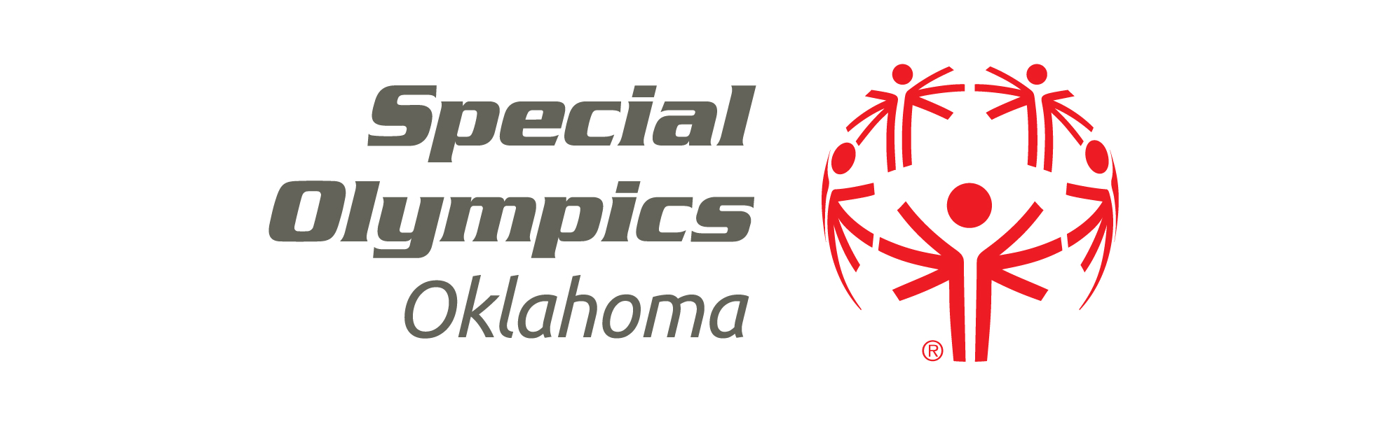
Two-line (standard) is best option for general use where space may be restricted:

The centered lock-up of the mark is best for vertical application of center-axis layouts.

SPECIAL OLYMPICS OKLAHOMA REFERENCES:
TEAM BRANDING
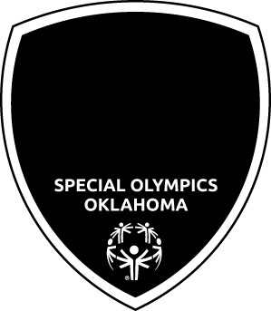
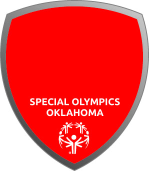
T-Shirts & Club Shield Designs
Teams or Clubs may create their own design for the top part of the shield.
Please refer to the “New” guidelines for Teams. Download
Questions, please contact Paige Martin, Marketing and Communications Manager.
One-Color Team Shield:

Two-Color Team Shield:

LAW ENFORCEMENT TORCH RUN BRANDING
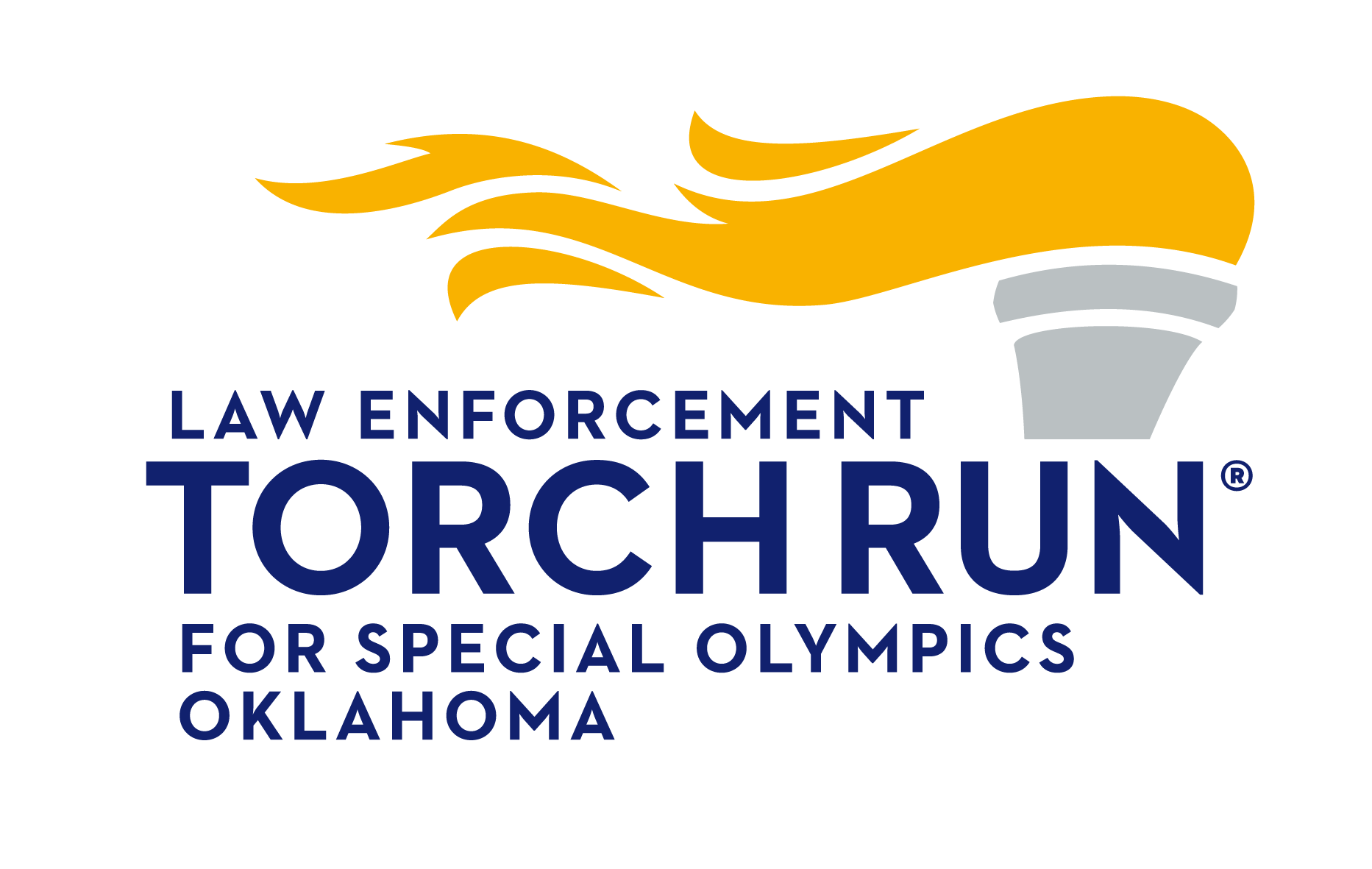
LAW ENFORCEMENT TORCH RUN LOGO
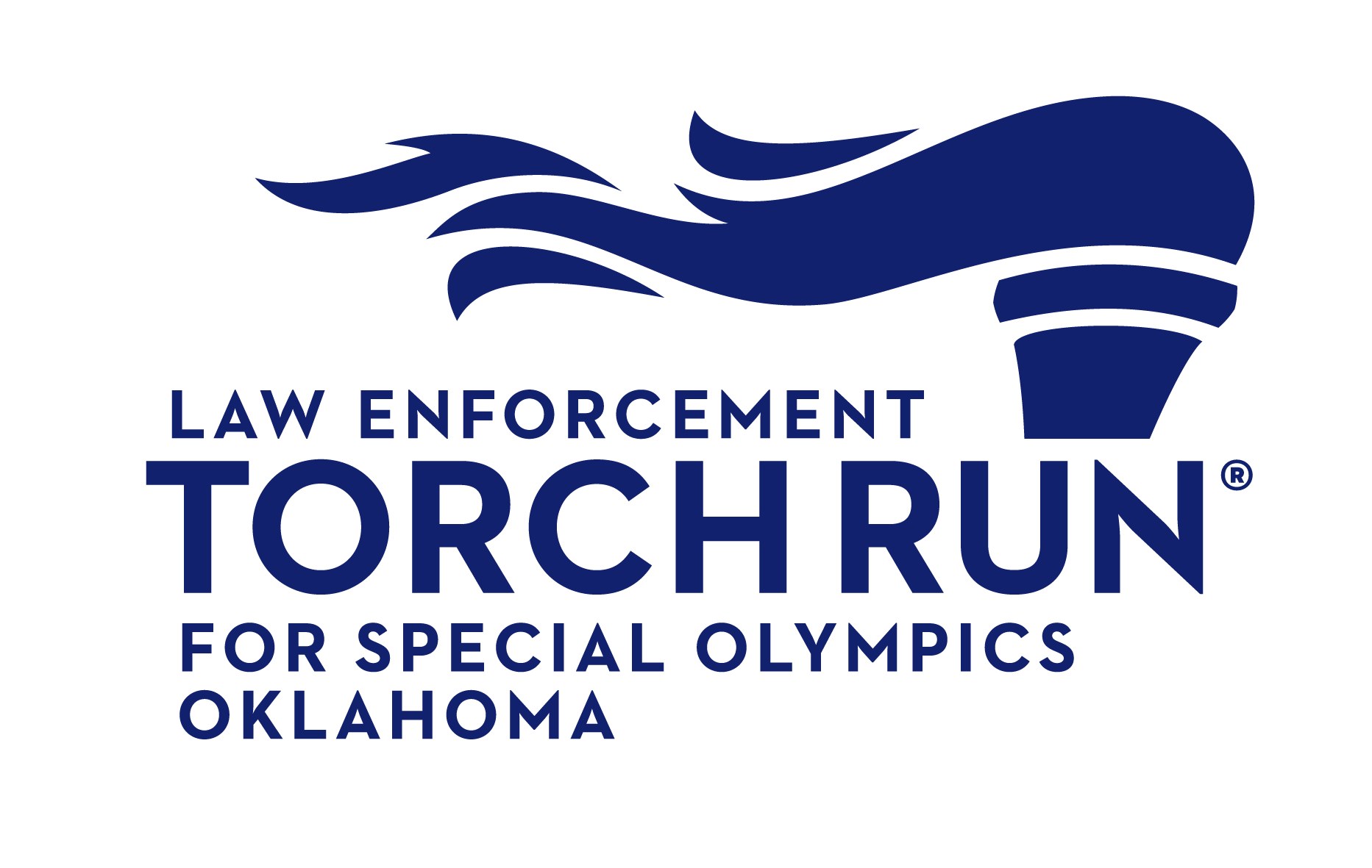
Our name is: Law Enforcement Torch Run® for Special Olympics Oklahoma.
Please note that ‘for Special Olympics Oklahoma’ is an integral part of our name. Our name should be used in full the first time it appears on any document. After the first use it may be abbreviated to LETR.
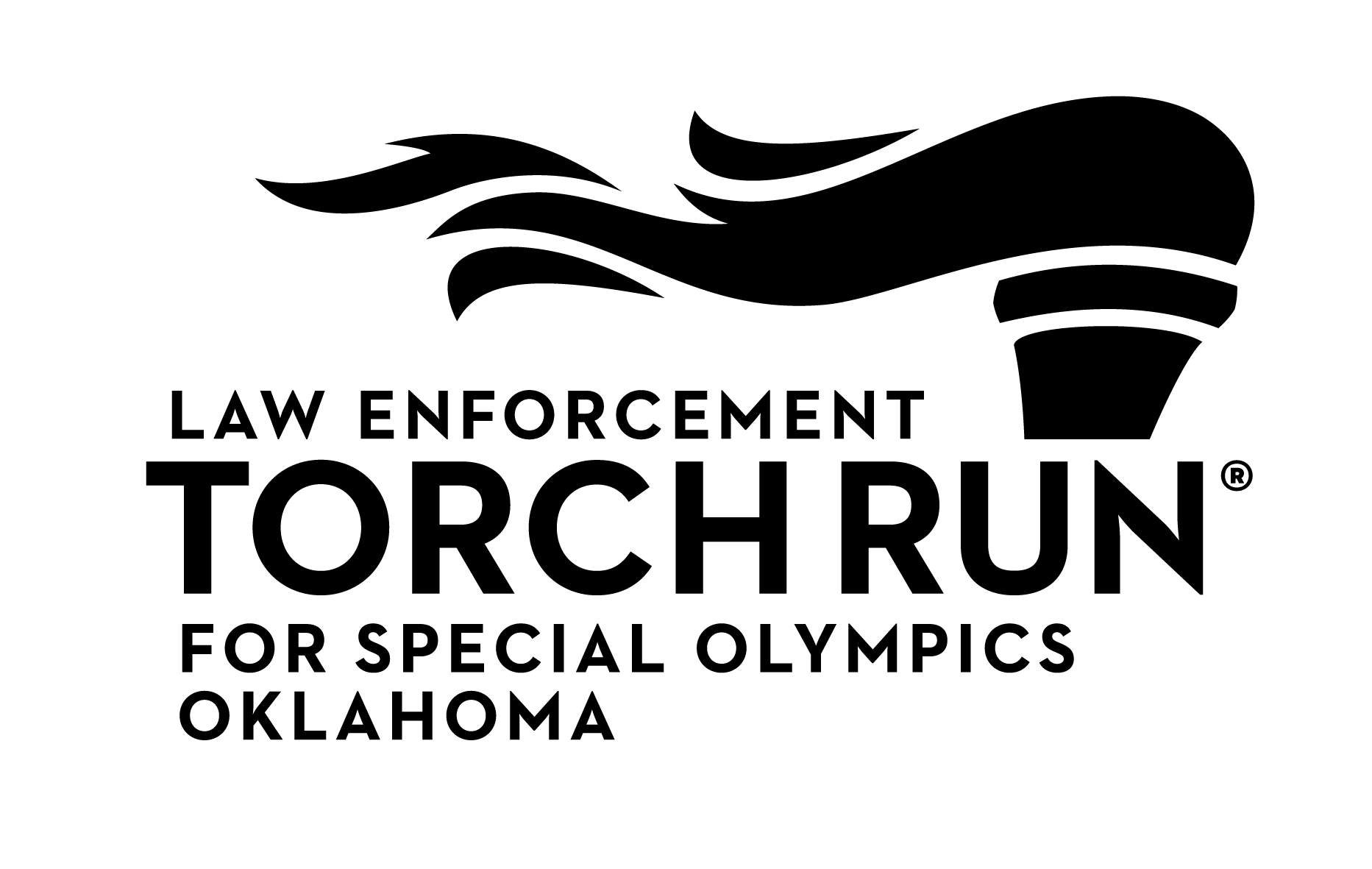
The mark comprises of the torch element and the logotype. The type used to create the logo type is Neutraface.
Mark colors:
When printing the mark in spot color please match to an up-to-date Pantone Swatch.
LETR Blue: Pantone® 281 M
LETR Gold: Pantone® 1235 M
LETR Silver: Pantone® Cool Gray 4 M
Free space:
Free space should be left around the mark. Other graphics elements or information should not be used in this area.


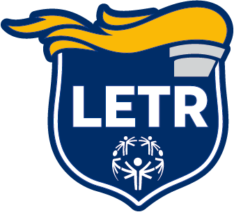
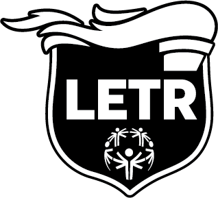
LETR Badge
The LETR badge has been created as a combination of the LETR and Special Olympics identities in a single emblem that can be used primarily to identify active participation within the movement.
- SPECIAL OLYMPICS OKLAHOMA LOGO
-
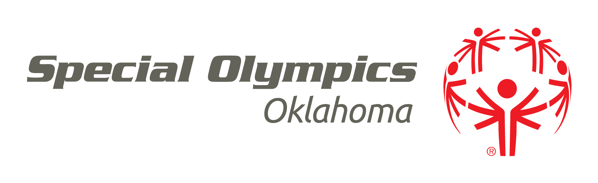
SPECIAL OLYMPICS OKLAHOMA LOGO
Our brand is our reputation, a reputation shared by all of the programs within Special Olympics. This reputation exists in the hearts and minds of the public and our stakeholders. Our reputation is informed primarily by what we do but it is also influenced by what and how we communicate.
The Special Olympics Accredited Program Mark is used to brand communications and items created by Special Olympics Accredited Programs.The mark is created by combining the Special Olympics Symbol, the Special Olympics Logotype and the name of the Accredited Program (Oklahoma) set in the typeface Ubuntu Italic. (Ubuntu is available as a free Mac or PC download at font.ubuntu.com.)
Color
Symbol: Special Olympics Red (Pantone® 186)
Logotype and Oklahoma: Special Olympics Grey (Pantone® 418)Two-Color artwork version:
These versions (greyscale & red) of the mark are for use against white backgrounds.Single-Color artwork version:
This version (all black or all white) of the mark is for use against a light, low-contrast background. Ensure there is sufficient contrast between the Mark color and background color.
The White version of the mark is for use against dark solid colors and appropriate photographic images.Free Space
Free space should be left around the mark.
No other graphic elements or information should be used in this area.Minimum Size
The minimum size is 1/3 inch or 8mm in height.
Please note this is a recommendation for standard print only. The minimum size will depend on the method of reproduction being used, the substrate onto which it is being printed, or the materials out of which the mark is being fabricated.The one-line lock-up is ideal where more horizontal space can be afforded for the mark (preferred):
Two-line (standard) is best option for general use where space may be restricted:
The centered lock-up of the mark is best for vertical application of center-axis layouts.
SPECIAL OLYMPICS OKLAHOMA REFERENCES:
- TEAM BRANDING
-
TEAM BRANDING
T-Shirts & Club Shield Designs
Teams or Clubs may create their own design for the top part of the shield.
Please refer to the “New” guidelines for Teams. Download
Questions, please contact Paige Martin, Marketing and Communications Manager.
One-Color Team Shield:
Two-Color Team Shield:
- LAW ENFORCEMENT TORCH RUN BRANDING
-
LAW ENFORCEMENT TORCH RUN BRANDING
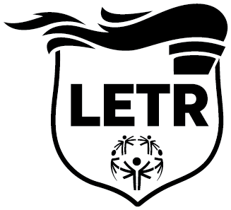
LAW ENFORCEMENT TORCH RUN LOGO
Our name is: Law Enforcement Torch Run® for Special Olympics Oklahoma.
Please note that ‘for Special Olympics Oklahoma’ is an integral part of our name. Our name should be used in full the first time it appears on any document. After the first use it may be abbreviated to LETR.
The mark comprises of the torch element and the logotype. The type used to create the logo type is Neutraface.
Mark colors:
When printing the mark in spot color please match to an up-to-date Pantone Swatch.
LETR Blue: Pantone® 281 M
LETR Gold: Pantone® 1235 M
LETR Silver: Pantone® Cool Gray 4 MFree space:
Free space should be left around the mark. Other graphics elements or information should not be used in this area.
LETR Badge
The LETR badge has been created as a combination of the LETR and Special Olympics identities in a single emblem that can be used primarily to identify active participation within the movement.